Client: OttomanCORE by Grigor Boykov
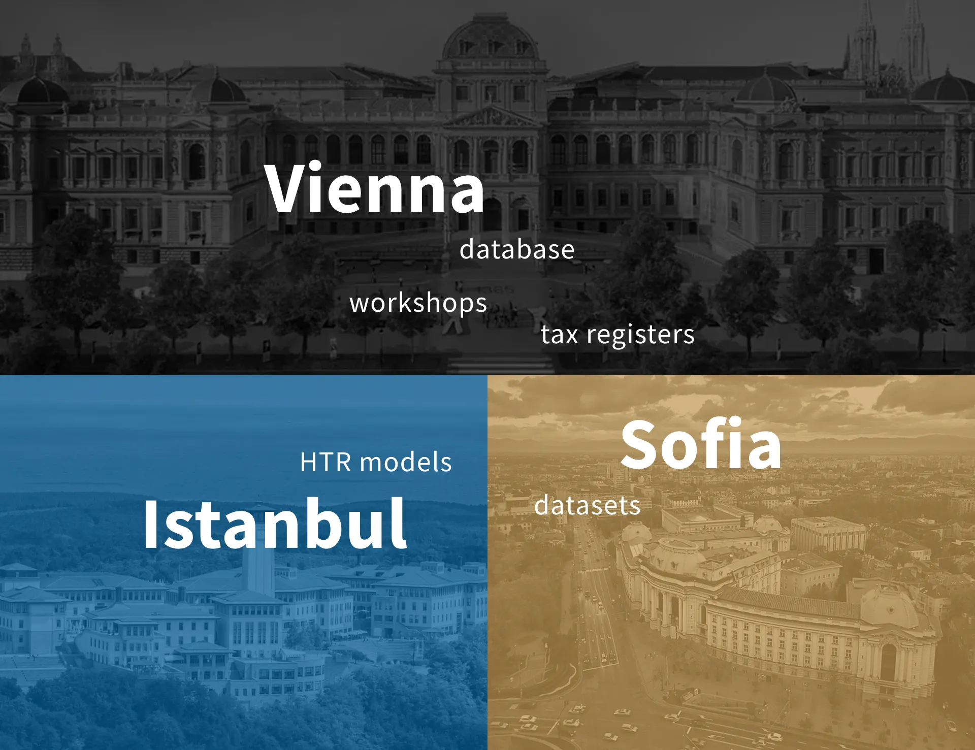
Collaboration: University of Vienna, Sofia University, Koç University, Istanbul
Services: Branding, Communication design, Graphic design
Date: Project runs 2025–2030

The project
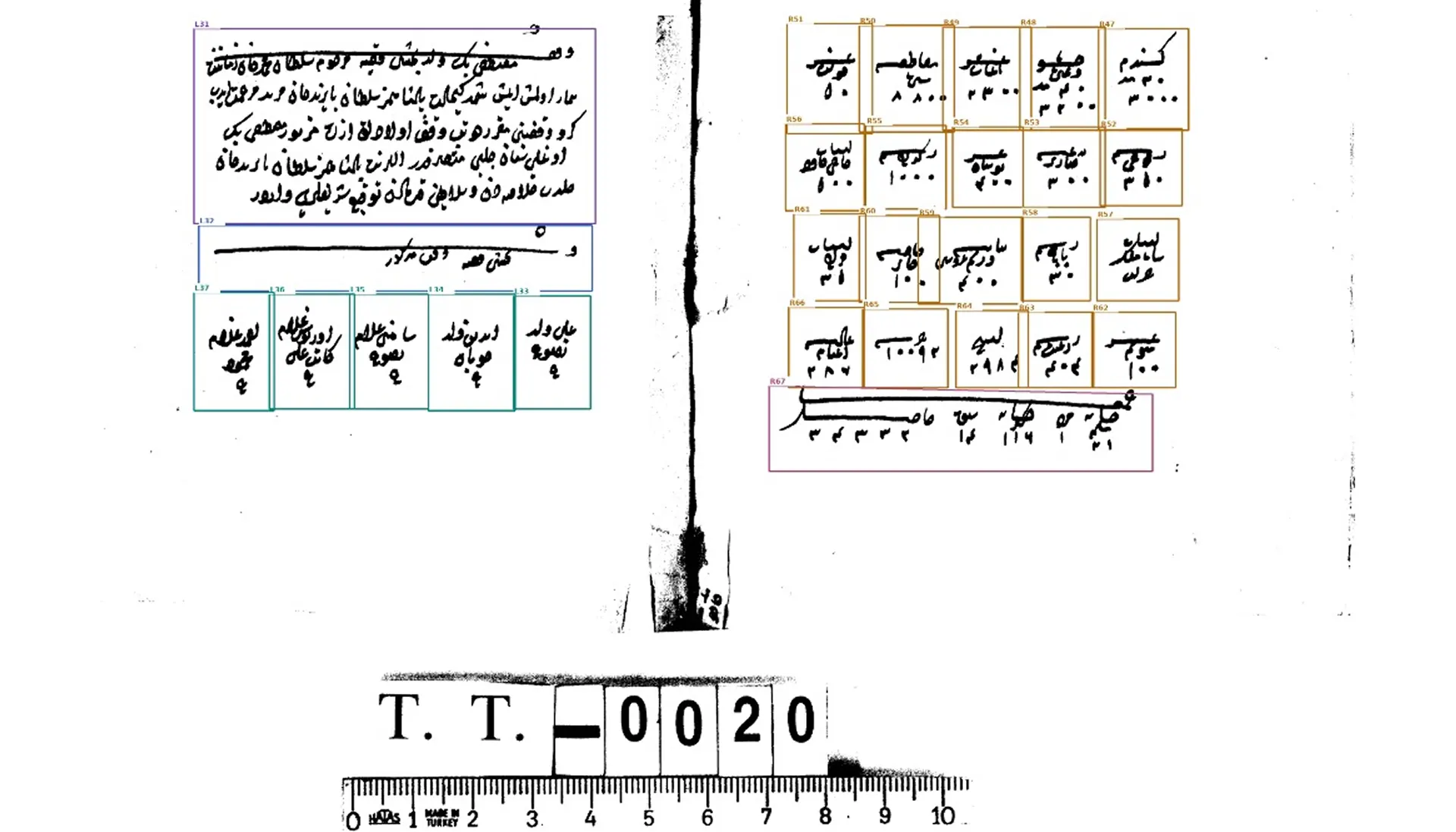
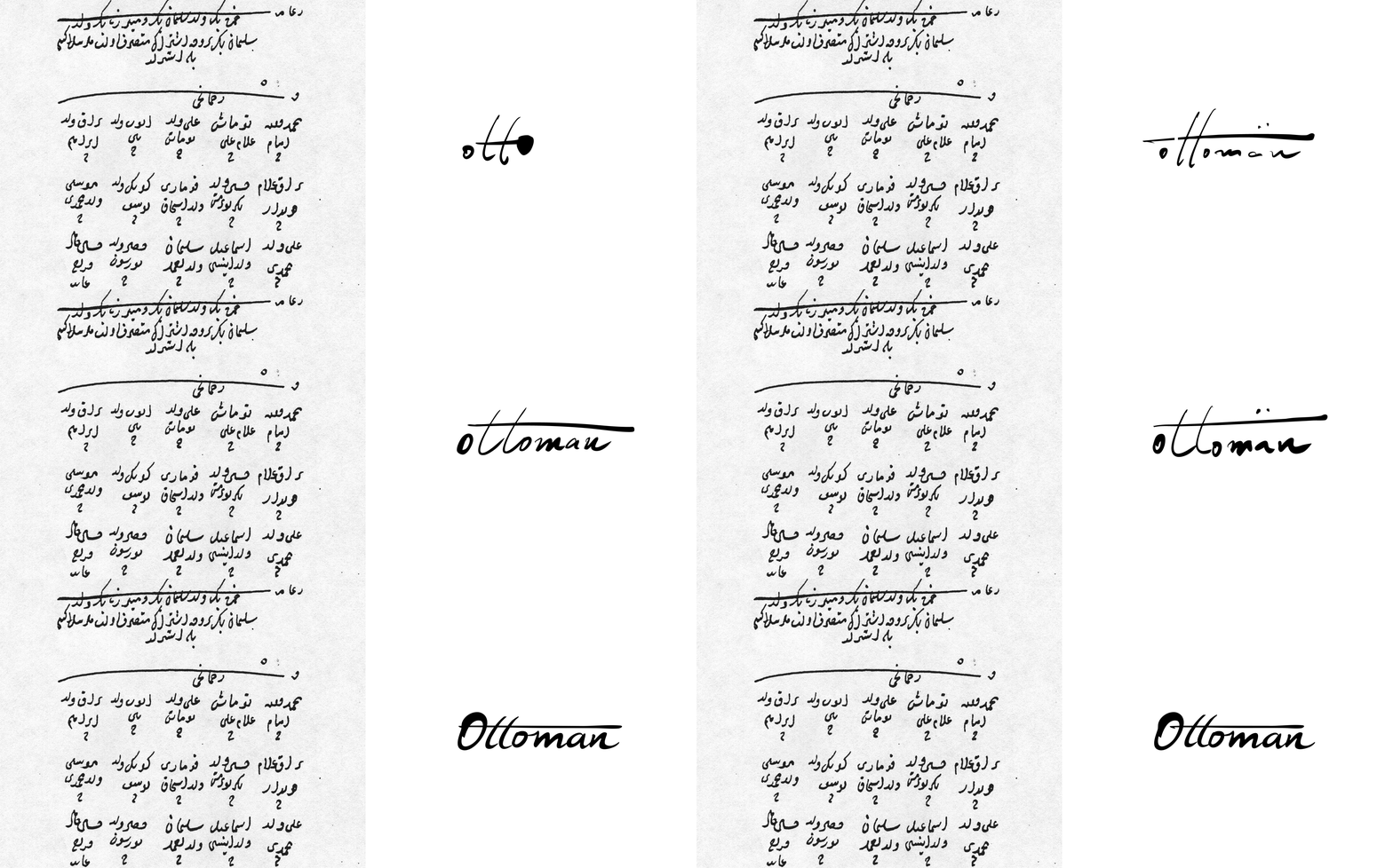
Thousands of handwritten Ottoman tax registers survive in Istanbul, Sofia and Vienna, and almost no one can read them at scale. OttomanCORE is teaching AI to read them. The identity had to join both worlds: the scribe’s ink and the algorithm’s logic.
Why this symbol
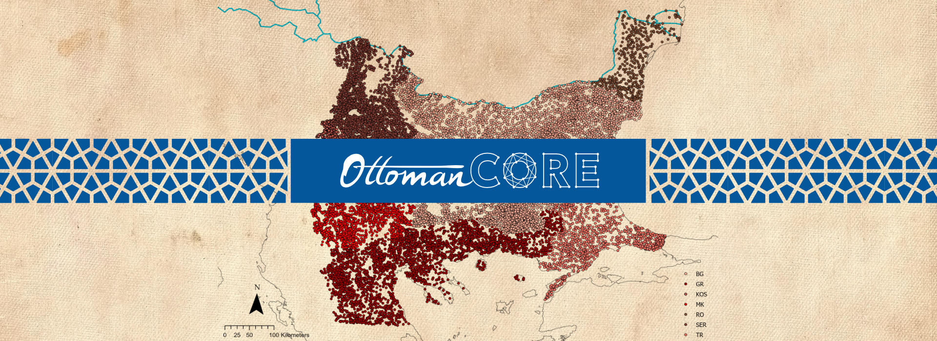
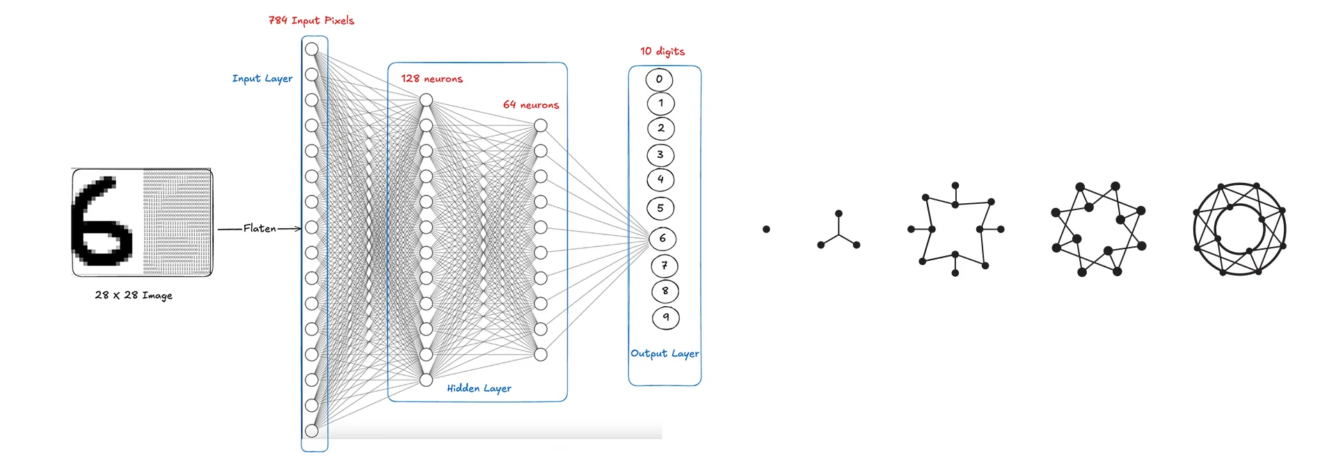
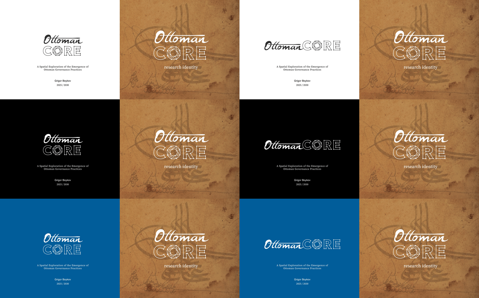
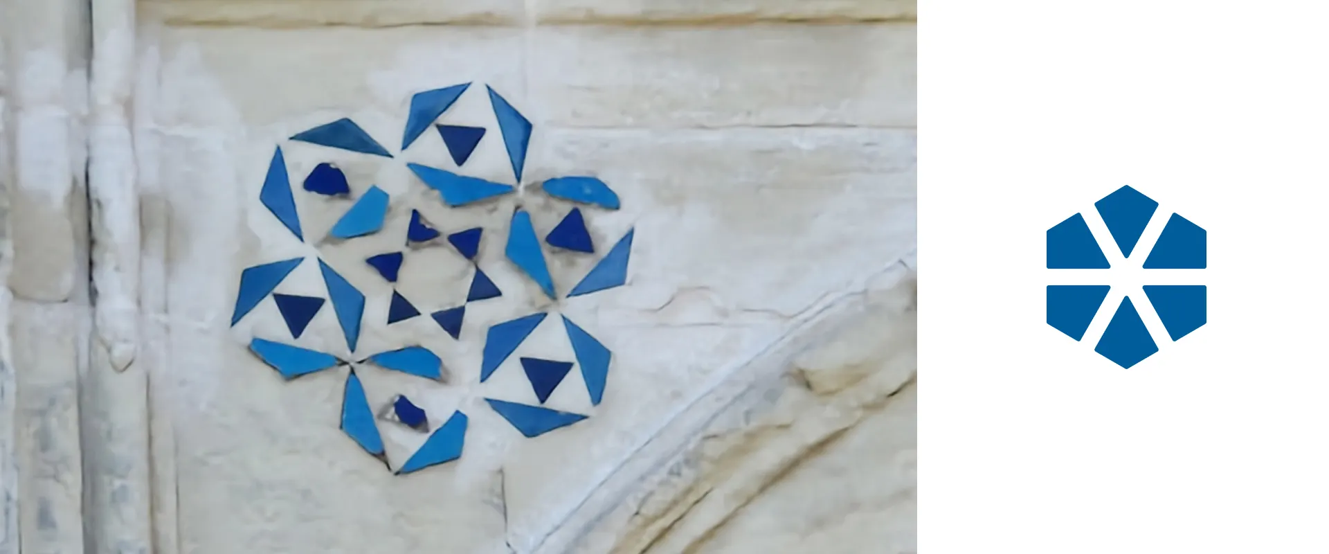
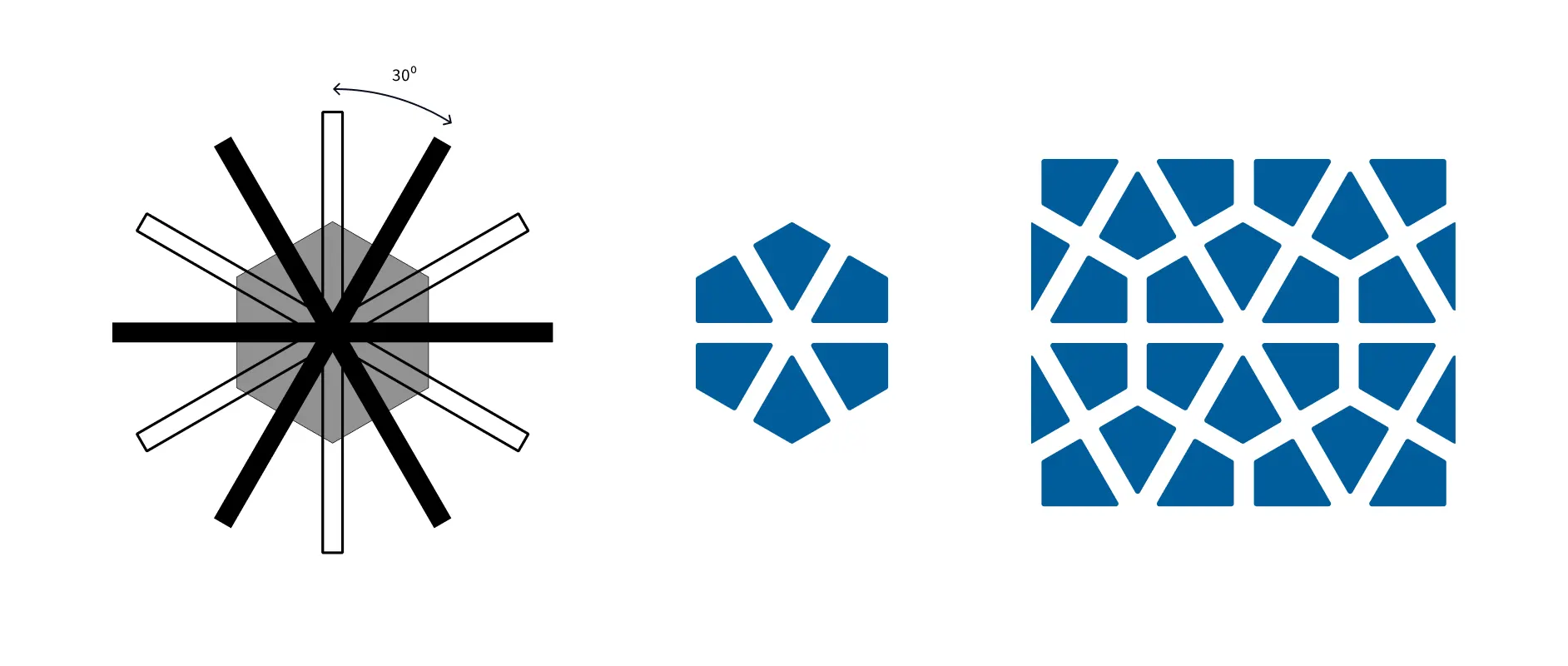
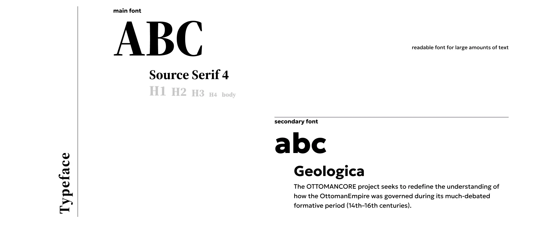
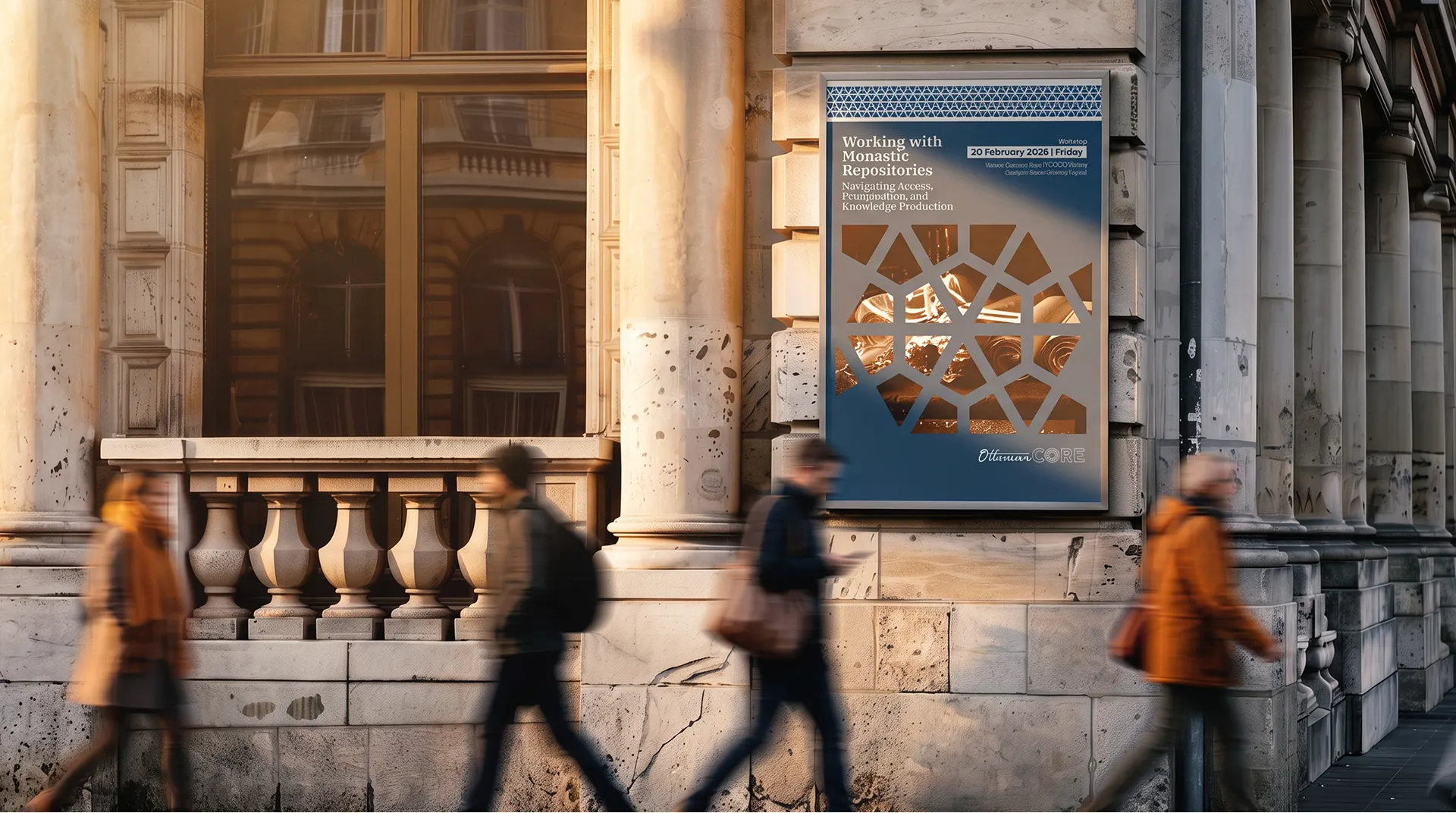
Ottoman star ornament and neural networks share the same logic: points, lines and simple rules repeated into something complex. The symbol sits on that overlap: ornament up close, a network from afar. The wordmark follows the same idea: a scribe’s hand for “Ottoman”, precise geometry for “CORE”.


The project today
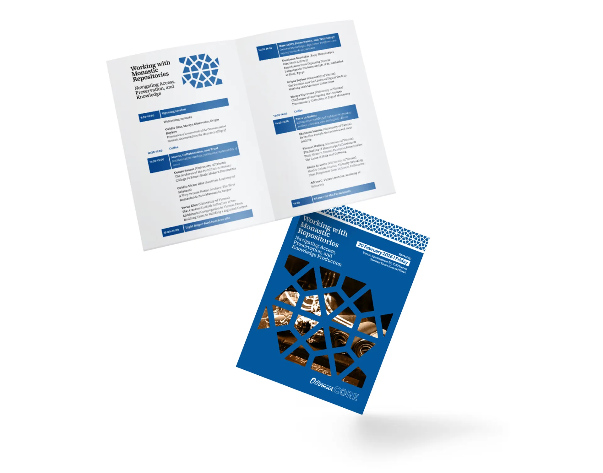
Today the identity runs across the project’s website, publications, workshop materials and conference presence, and it gives a demanding research project a face as rigorous as its method.